Hypothesis Driven Development
On the Commerce-Activation team, our goal is to guide merchants to their first sale. We run quick experiments to test and gather live data in order to validate design and user value.
ROLE
Product Designer
Strategy, Design, Prototyping, Visual Design, QA
DURATION
Usually between 3-4 weeks per test
THE DREAM TEAM
Content - Shilpi Tomer
Product Manager - Lukas Thomas
Eng Lead - Charlie Clark
Overview
Goal.
Get merchants to their first sale, by providing clear, guided experience to onboard them onto our platform and complete store setup.
Process.
Instead of investing time and effort in building features that might not work, we use hypothesis and fast design execution, and run A/B tests to validate our goal metrics.
Result.
Based on the live data we collect, we decide if we discard our experiment completely, keep iterations, or perfect it and add it to our product.
Our Experiments.
Getting to know our users.
Guided store setup.
Improving payment connections.
Adding demo products.
Experiment #1
Getting to know our users
We launched a new set of questions to understand who are our users.
Presenting a short flow for users we identified with Commerce intent, and starting to collect data we didn’t have before.
We were getting valuable learnings about our users, but also noticed a significant drop-off in one of the screens.
We changed the layout.
Our hypothesis was that presenting all questions on one screen, might be overwhelming and cause the drop-off that we noticed.
So we presented each question in a separated screen, and changed the dropdown into multi select questions.
This UX change brought our completion rate from 21.8% to 35.2%.
BEFORE
AFTER
We also noticed 30% of our users were selecting ‘other’.
So we turned ‘other’ into a free-text field once selected, to collect data and understand what answers we are missing.
Based on the data we collected, we added those options in.
This experiment proved to contribute a lot of valuable learning and was a good foundation for our next experiments. After a few iterations, It was added to our product and has been part of it since.
Experiment #2
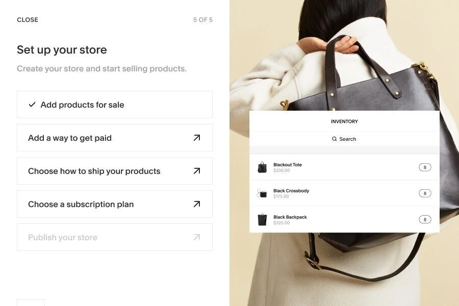
Guided Store Setup
Our goal was to increase % of users completing their online store setup.
Background
Previous research found that the majority of people who didn’t sell within 90 days fail to complete crucial steps of the store set up process.
The design included all tasks needed in order to complete store setup, and a guided link to the place to do so.
For first time users-
the wizard shows up at the end of the questions flow.
We needed an entry point for existing users and for all users to relaunch the wizard.
So we placed launching cards, for the two different states.
Interesting learnings
Almost half of our users selected ‘Remind me later’ when dismissing the card.
Where are our users in their journey?
Most users that see the wizard are existing users, who already added products.
What is the first action the users prefer to take?
Most users chose to connect a payment processor as their first action.
How long till they complete store setup after seeing our experiment?
Most users completed store setup up to 7 days after seeing the wizard.
How many users engage with the wizard?
80% of users viewing the wizard, ended up clicking on one of the actions.
The experiment was a huge success
Store setup completion went up by 30%!
Experiment #3
Improving Payment Connections
Our goal was to increase % of users connecting a payment processor.
Background
50% of Commerce intent users are not seeing the payments panel, and 75% of users are not connecting a payment processor.
We launched 2 quick experiments.
The first was aimed at getting users to the payments panel.
Our design included a card, that was shown in a high trafficked panel, to draw users to connect a payment processor.
The experiment was a success
1. Successful connection rates has doubled.
2. Trial to subscription conversion increased by 20%.
The second experiment was aimed at getting users to connect, once they’re in the panel.
After talking with customer support, we learned what were the most concerning questions to users before connecting a payment processor, and surfaced answers to those in the panel.
The experiment was discarded
Conversion rate of connecting a payment processor increased only by 1.7%,
Which wasn’t significant enough to keep on our platform.
Experiment #4
Adding demo products
Background
Based on data we collected:
1. Most users edit demo products vs adding a new one.
2. Most common product categories are: Apparel, Art, Food & Drink and Beauty.
Hypothesis
By showing users personalized demo content that’s more applicable to the type of product they want to sell, they are more likely to subscribe and start selling.
Process
Aligning on user criteria and a high-level wired flow.
Exploring different workflows and scenarios.
Mocking a higher-fidelity flow to review as part of our existing platform.
Creating 3 different layouts / IA options
We ran a quick user-testing to validate the best usability option.
After many deliberations between design and product, we couldn’t reach an agreement on one option to go with, so our best approach was to put this to test.
The test
Worked with Usertesting.com to run an unmoderated test with 10 users, synthesized all videos and reached a conclusion. We ran 2 versions of the test, one with a revered flow to prevent bias.
Learnings
We learned our third option (C) was the most intuitive, organized and easy to navigate by our users.
Final design and specs
Default
1 Product Selected
2 Products selected
The experiment was discarded
We learned that the experiment had no top-level impact on Trial-to-Sub conversion,
and even appeared to harm engagement vs. similar high-intent users.


