A Design System
and Site Architecture
The life insurance application was slated for NM Connect, the platform for all new digital tools and services for business users. When we launch our design efforts, NM Connect lacked a design system and toolkit, so we built one to allow our work to scale efficiently and consistently.
ROLE
Senior UX Designer
Strategy, UX Design, QA
DURATION
Jan 2018 - July 2019
THE DREAM TEAM
Visual Design - Gavin Bardic
Design Manager - Alex Wilcox Cheek
Overview
Problem.
Our design system was specifically designed for input forms and work management for business users. More than anything, it needed to create the most efficient process for them to complete applications, gather documentation, submits, and track progress.
Process.
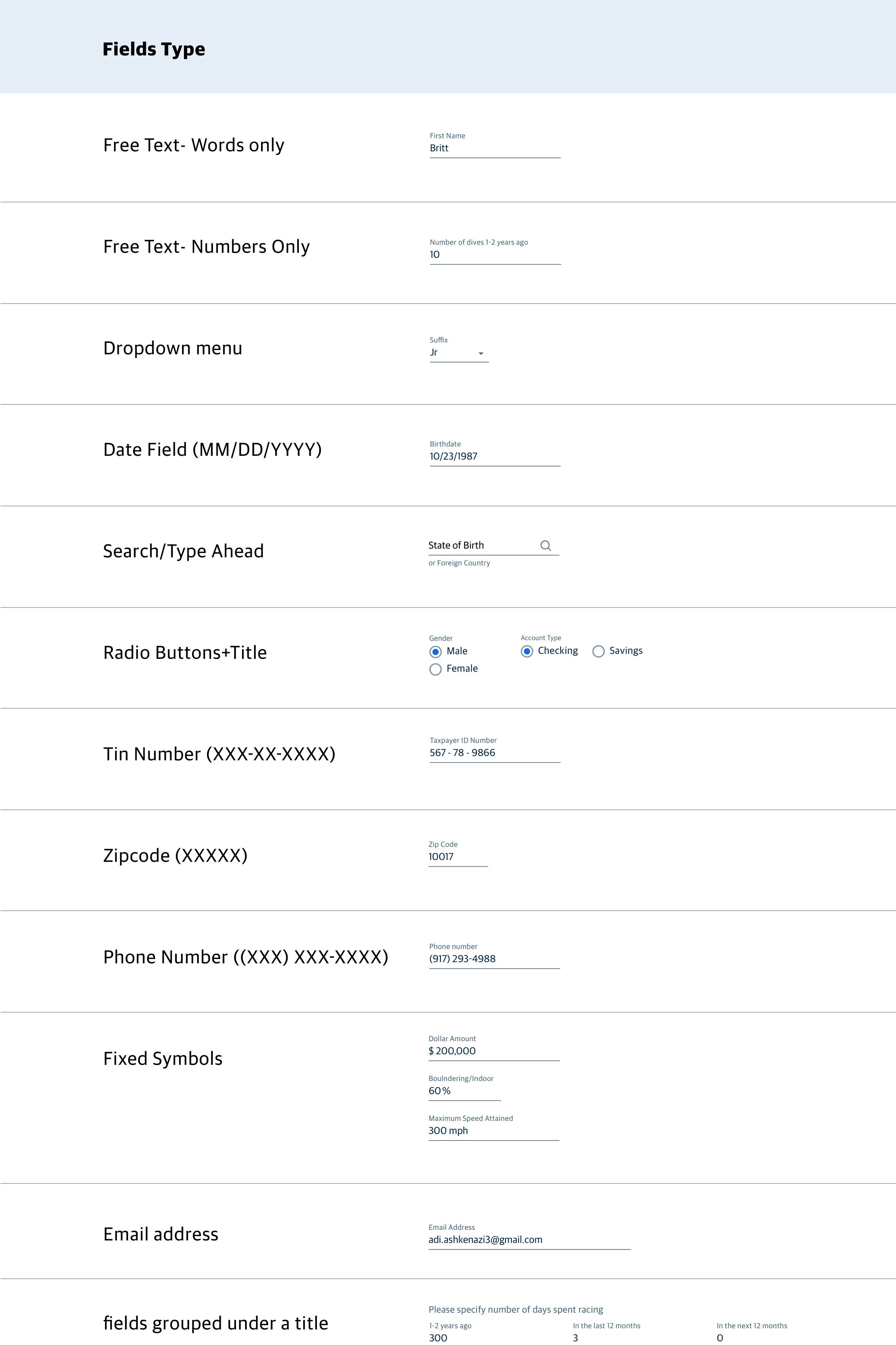
We began with a new grid system for dense form designs, identified the range of input types, and translated many of the paper form designs into more digitally-friendly patterns.
Result.
A toolkit that our engineering teams could easily pull from and a system that could easily upgrade to the bigger NM Connect toolkit, which came a year later.
Prior State
This times a thousand. Here is a sample of a few of the forms that required analysis. The biggest challenge for our team was the translation of these forms into a digital language that could be repeated and scaled.
Building a UX
Component Library
The toolkit not only created efficiencies for engineers but for our design team, too. By establishing patterns, we didn’t have to create wires and screens for every single application scenario. With 1,400 questions, multiple user types, and 50 state variants, every application that’s submitted is different.
Changing Bad Habits
Our users were power users: tabbing through the application with experienced knowledge of what information is expected of them. But traditionally, users would often submit applications with incomplete fields. In fact, they were incentivized to. Getting applications in quickly meant that they would get paid sooner. Our system was designed to help them enter clean and structured data.
MESSAGING STRATEGY INCLUDED 2 TYPES OF ERRORS
Auto-Filled Fields
Our system also auto-filled as much information as possible. For instance, starting with a zip code meant that they could skip the city and state fields. When our application integrates with other data systems, more and more fields will be pre-populated.
Visual Design System
FINAL


One Platform with Interconnected Workflows
In conjunction with a broader redesign of NM Connect, I helped align Applications with other products under a new Insurance tab. The new architecture also introduced landing pages where users could monitor applications and servicing needs across their entire business. Rather than our system operating in a silo, it was designed to connect across bigger workflows.


