Digitizing the Life Insurance Application
Life insurance is the core of Northwestern Mutual. This project was the first to shape the end-to-end digital experience for applying a Life Insurance application.
ROLE
Senior UX Designer
Strategy, Content, Concepting, Design, Prototyping, Documentation, QA
DURATION
Jan 2018 - July 2019
THE DREAM TEAM
Visual Designer - Gavin Baradic
UX Researcher - Madeleine Melcher
Copywriters - Greg Pfister, Foram Nyberg
Design Lead - Alex Wilcox Cheek
Overview
Problem.
A financial advisor could submit up to 15 life insurance applications per day for their clients. Their current process is manual, repetitive, and messy. In fact, most applications that get filed arrive with significant gaps.
Process.
We took a paper application packet of over 1,500 questions and 50 state variants and created a reflexive design system to surface only the relevant questions to the applicant, product, and state. Our design system helped us efficiently create patterns for dozens of different scenarios.
Result.
Research showed fast, keyboard-driven input and wide enthusiasm from business users. The field process transformed into a modern, streamlined, and intuitive workflow while the home office got a system that brought in clean applications and structured data for efficient processing.
Starting Point
Time-consuming paper application.
It required the financial advisors to print all possible forms to bring into meetings with potential clients.
The filled applications suffered from:
· Unclear handwriting
· Unanswered questions
· Redundant client information
· Generic questions for all clients
Discovery
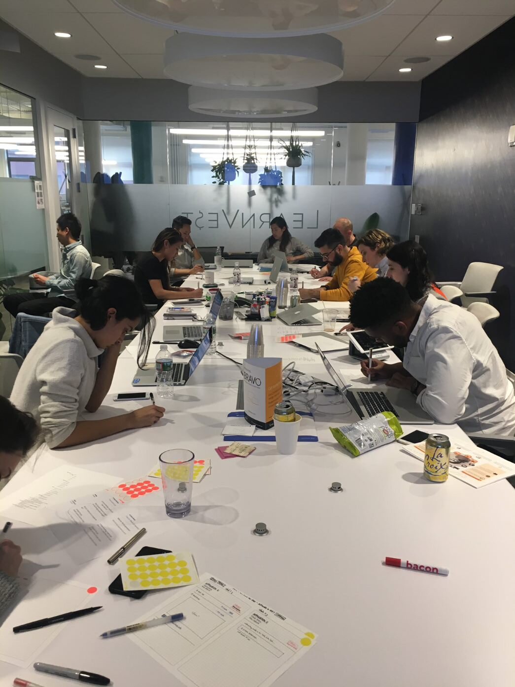
Initiated a workshop to bridge the gap between the client and the advisor experience.

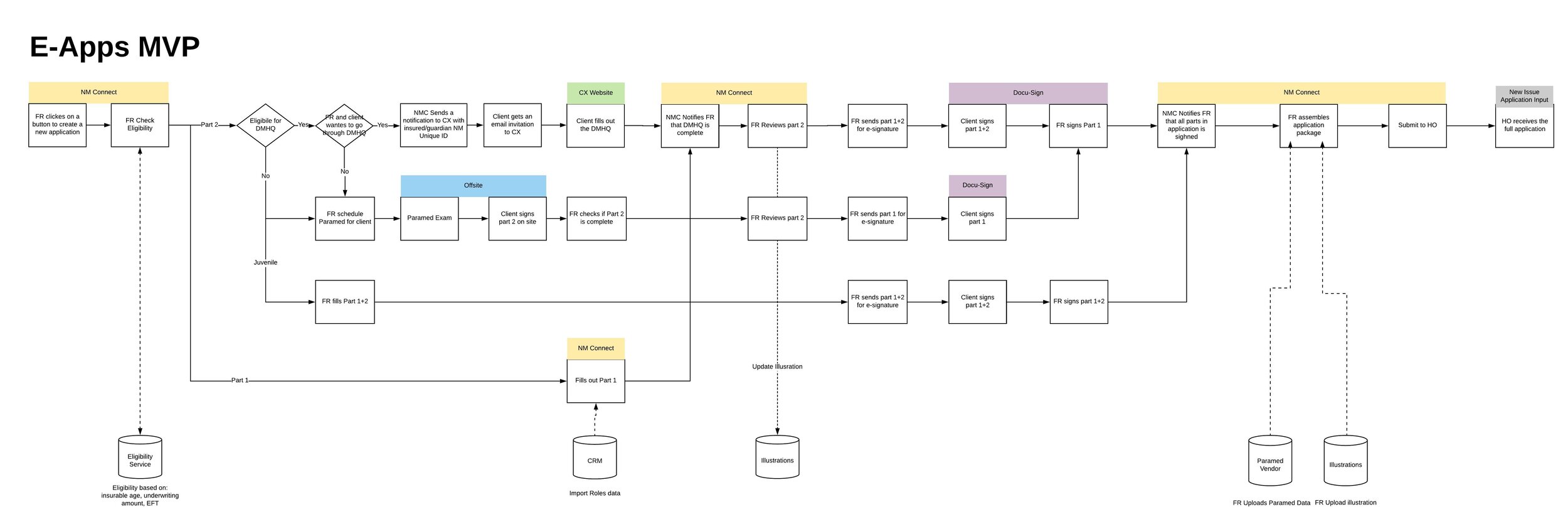
The advisor experience would interact with the client experience, which is designed by a different team.

In order to identify these touchpoints, we ran a workshop that included both teams.

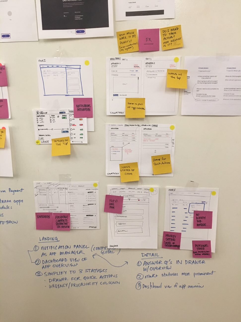
Assembling all the data we received into data points we can use in our design process.
The workshop helped us map the hand-off points and scope MVP.
Content Strategy
Comprehensive understanding of the existing form.
· Why do we ask these questions on the application?
· Are all mandatory or some are optional?
· Which questions are primary/conditional?
· How can we re-group them in a better way?
· Can we change the language at all?
Creating new content sections and testing with financial advisors.
We build an Invision prototype and used usertesting.com for our participants to view the new structure, interact with the sections, and provide us with feedback.
Iterating the design and content based on user feedback.
Presenting the post-research iterations to product and engineers, helped communicate the upcoming changes and back our decision-making process as a design team.
Introducing a Setup Flow
Reducing the overall number of questions and providing a tailored experience for the user.
THE CURRENT APPLICATION
Presents the user with every possible question, whether relevant or not.
THE PROCESS
Identifying the questions that can be asked upfront, to eliminate irrelevancy.
DESIGN SOLUTION
By adding a few key questions upfront, we eliminated the irrelevant questions on the application.


Conditional Design Patterns
We were able to eliminate 514 redundant questions, by only surfacing the relevant questions to the users.
For a productive financial advisor, that’s almost 8,000 questions per day, drastically reducing time-to-submission and freeing up their office staff.
BEFORE
AFTER
Forming a Design Library
The goal was to establish design patterns instead of wiring each and every single question.
One library to accommodate all types of questions, states, and input fields. This was also the basis of collaborating with our visual designer to creating a new tool kit to be used by our developers.
End to End Experience
Other than submitting an application, the advisor needs a place to manage, track his existing applications and navigate between the screens to complete different workflows.
Applications Home
Where the financial advisor can track all clients' applications.
It was the first design on the NM Connect platform to help advisors work across their business, keeping their finger on the pulse.
Application Manager
An application manager was designed to collect documentation, medical tests and submit the application for underwriting.
The navigation tested extremely well
We tested with financial advisors, used Usertesting.com and an Invision clickable prototype.
We watched the videos as they had to complete tasks in the flow and rank the level of difficulty for each task.
"Clear and intuitive flow"
"Easy to navigate"
"Would surely expedite the team’s communication"


